In the previous chapter we have discussed about variables, constants, loops and control statements. This chapter will give the ways of creating and implementing the controls. It also helps us to understand the concept of control Arrays. Controls are used to receive user input and display output and have its own set of properties, method and events. Let us discuss few of those controls in this chapter.
Controls
Customs controls are the building blocks of a Visual Basic application. Controls are used to add significant functionality to our programs, and they are easy to work. In Visual Basic, forms are the foundations and are generally used to build programs. A form is where you put all the things that people interact with as they use your program. Those things you put on the form are controls, which enable the people who use your program to do things such as enter text and click buttons. That is, controls are also interfaces between the user and the application. Every control has got its own properties, events and methods. You can set the properties and write the code to make the control active.
For example if you build a house, you start with a foundation – think or this as the form. On top of the foundation, you add all the things that allow you use the house; a floor, walls and doors. These things are the controls.
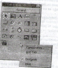
The toolbox is the containing window that holds the custom controls for your applications (see figure 4.1). These are also several advanced controls that come with Visual Basic. Some controls work with multimedia, and others utilize the Internet. Best of all, you can now cerate your own ActiveX custom controls and add them to you Toolbox.
Adding and removing controls
You can add controls to a form in tow ways: by double clicking and by drawing. Whenever you double click an icon on the toolbar, the associated controls appears on you form. When you do this, though, you control where the control goes; you’re at the mercy of Visual Basic. When you draw a control on your form, you can put it wherever you want it.
Draw a control on a form
- Click the control’s toolbox icon
- Move the mouse pointer over your form. Notice that your pointer is now shaped as a crosshair instead of an arrow.
- Click (and hold) the mouse button where you want the control to go.
- Drag the mouse down slightly and to the left. As you move the mouse, notice that a box stars to appear.
- When the box is the proper size, let go of the mouse button. The control you selected now appears on the form.
Remove a control from a form
- Select the control you want to delete by clicking it. The control you selected will appear with a box at each corner and side.
- Press the Delete key.
You can also remove a control by right clicking it. From the context menu that appears and selecting Delete.
How to Size and position a control
When you’re drawing controls on a form, you don’t have to be exact. It’s very easy to make them bigger or smaller, and to put them in a different spot on the form.
Size controls with the mouse
In the toolbox, select the pointer tool (if it isn’t already selected0. on your form, select the control you want to resize. Grab a sizing handle with the mouse by moving the pointer over it and then holding down the left mouse button. You know when you’re over the sizing handle because the mouse pointer turns into a double – sided arrow. While holding down the mouse button, notice that a box appears. The box shows you what the size of the control will be. When it’s the right size, release the mouse button. Changing the position of a control is also easy. Just click it to select it, and drag it to its new position.
Intrinsic controls
Intrinsic controls are automatically displayed in the tool box when a form is loaded. When you program in Visual Basic you’ll use a relatively small set of controls. However, these controls are very powerful. With them, you can add buttons, check boxes, labels and text boxes to your programs. You can use them to see files on you hard drive right from your program. You can even read database! These basic controls are intrinsic controls.
From object
The most basic object you will be working with in Visual Basic is the from object, which is the visual foundation for building an application. It is basically a window that you can add different elements to in order to create a complete application. Every application you can see on the screen is based on some type of form. Before going into the details of application development, let’s take a look at the most basic form object that you will probably use most often in your projects: the single form.
As you learn Visual Basic, most of your applications will only have one interface, which is the single form. When you become more experienced and start writing letter, editor styled applications, you may want to use multiple forms, called documents.
The appearance of Forms
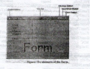
The main characteristic of a form is the title bar, on which the form’s caption displayed. On the left end of the title bar is the control menu icon. Clicking on this icon opens the control menu. On the right side of the title bar are three buttons minimize, maximize, and close. Clicking on these buttons minimizes, maximizes and closed the form. When a form is maximized, the maximize button is replace by normal button, which restores the form to its size and position before it was maximized.
Control Menu
Control menu is a simple menu that allows you to restore, move, resize, minimize, maximize and close the form. The enable this button on your from, set the form’s control box property to true in the form’s properties window or determines whether the control-menu box is displayed on the form at run time. That is, if it is set to false the control box won’t appear at left corner of the title bar of the form.
The control menu controls the following commands.
- Restore Restore a maximized form to its size before it was
maximized. Enabled only if the form is maximized.
- Move let the user move the form around with the keyboard.
- Size Lets the use resize the control with the keyboard.
- Minimize Minimizes the form.
- Maximize Maximizes the form.
- Close Close the form.
Form properties
The following shows the properties for a form object
| ActiveControl |
Active From
Appearance
AutoRedraw
Backcolor
BordeStyle
Caption
ClipControls
Control Box
Controls
CurrentX
CurrentY
Draw Mode
Draw StyleDrew width
Enabled
Fill Color
Fill Style
Font
Font Bold
Font Italic
Font Name
Font Size
Font Transparent
Font Underline
Fore Color
HDC
HeightHelp Context ID
h Wnd
Icon
Image
Keypreview
Left
Lind Mode
Link Topic
Max Button
MDIChild
Mouse Icon
Mouse Pointer
Moveable
NameNegotiate Menus
Picture
Scale Height
Scale left
Scale mode
Scale Top
Scale Width
Shown in Taskbar
Tag
Top
What’s This Help
What’s This button
Width
Window State
The load and Unload to load and unload the forms. The load statement has the following syntax:
Load form Name
And the Unload statement has this syntax:
Unload form Name
The form Name is the name of the form to be loaded or unloaded. When Visual Basic starts, it loads the default Form, say Form1, and displays it. To load other Forms, say form2, the load statement is to be issued as in below:
Load Form2
This statement will load the Form2 into the memory. But the Form2 will not be visible immediately. To make it visible its show method (explained short) must be called.
This method removes a form from the screen, but doesn’t unload it
Form Name. Hid
When a form is hidden, the user can’t interact with it.
Common Intrinsic Controls
Controls are elements that provide the user interface. The user interface is what appears in the application’s window when it runs. It enables the user to work with the application such as entering text and clicking buttons. The elements of the User Interface are common to all windows applications and they are called as Intrinsic controls. They are all shown as icons in the Visual Basic toolbox.
The text box control
It provides an area to enter or display text. It behaves like a min text editor.
The label control
This control displays text on a form that the user can’t edits. Labels commonly identify other controls.
The command button control
Carries out a command or action when a user chooses it.
The option button control
Option buttons, or radio buttons, appear in a group, and the user can choose only one of them
The list box control
It contains a list of options from which the user can chose one or more. Ti can contain many lines, and the user can scroll the list to locate an item.
The combo box control
The combo box control is similar to the List box control, button it contains a text edit field. The user can either choose an item form the list or enter a new string gin the edit filed.
The picture control box
The picture box control is used to display bitmaps, icons or windows metafiles.
The image control
The image control is similar to the picture box control and it can also display images, but it supports only a few features of the picture box.
The shape control
The shape control is used to draw graphical elements, such as boxes and circles on the surface of a form.
The line control
The line control is used t draw lines on the surface of a form.
The frame control
This control is used to draw boxes on the form and to group other elements.
The drive list box control
It displays the drives on the system in a drop down list from which the user can select a valid drive.
The directory list box control
It displays a list of all folders in the current drive and lets the user move up or down in the hierarchy of the folders.
The file list box control
It displays a list of all files in the current folder.
The timer control
It is used to perform tasks at regular intervals.
The horizontal and vertical scroll bars
These controls can be used as inputs devices or indicators of speed or quantity for example to control the volume of an computer game or to view the time elapsed in a timed process.
Common methods
- Move Changes an object’s position in response to a code request.
- Drag Handles the execution of a drag and drop operation by the user.
- Set Focus Gives focus to the object specified in the method call.
- ZOrder Determines the order in which multiple objects appear on screen.
- Refresh Forces a complete repaint of a form or object
- TabIndex Determines the tab order of most objects within their parent form.
The following is the list of common events:
- Click The user click primary (left) mouse button on an object.
- Dbl Click The user double clicks the primary (left) mouse button on an object.
- Drag drop The user drags an object to another location.
- Drag Over The user drags an object another over control.
- Got focus An object receives focus.
- Key Down The user presses and releases a keyboard key while an object has focus.
- Key up The user releases a keyboard key while an object has focus.
- Lost Focus An object loses focus.
- Mouse Down The user presses any mouse button while the mouse pointer is over an object.
- Mouse Move The user moves the mouse pointer over an object.
- Mouse Up The releases any mouse button while the mouse.
- Change Indicates that the contents of the control have changed.
Option Button
Option button controls (shown here) are used to allow the user to select one and only one, option from a group of option. Usually option button, if there is to be only one group together within a frame control, but they can also be grouped on a plain from, if there is to be only one group of option buttons. Thus, if you had a frame specifying a delivery method, you might have one button for UPS (united Parcel Service) and another for courier delivery. Products can only be shipped by one of these methods (not both and not one). In contrast, option buttons representing, say bold and italic settings for text would not make sense. Text can be both bold and italic, or neither (none).
Check Box control
A Check Box control is rather similar to an option button. Both often partake in groups, and the value property is tested to see if a check box is on or off. But there are two fundamental differences between check boxes and option buttons: check boxes are valid as single controls- a single option button is probably counter intuitive. Check boxes (even when a group) are not mutually exclusive. Finally, check boxes have three possible settings for the value property.
The picture box control
As you might expect, picture boxes often graphics (for example, bitmaps, icons, JPEGs and GIF s). In this role. Picture boxes are similar to image controls. However, picture boxes and images have slightly different properties and therefore behave differently. If you just want to show a picture, then a image control is usually a better choice than a picture box, images take up less memory and are a light weight version of picture boxes. However, if you want to move the graphic around the form, a picture box produces a smoother display. In addition, you can create text and use graphics methods in a picture box at run time. The graphics methods enable you to draw lines, circles and rectangles at run time. But most importantly for this application, picture boxes can act as containers for other controls. Thus you can place a command button within a picture box. In this respect, picture boxes function as “forms within forms”
Picture Box properties
Picture sets the graphic to be displayed in the control. At design time a graphic file name can easily be specified through the properties window. But to assign a picture at run time the load picture statement is used as the following:
Picture1. Picture = Load Picture (“C: /Windows/ Clouds.bmp”)
The load picture statement loads the clouds. Bmp file from the disk to memory and assigns it to the picture property of the picture 1 control.
Auto size (Boolean) Determines whether a control is automatically resized to display its entire contents.
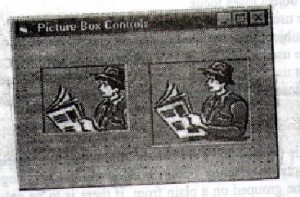
Figure: Different appearance of a same picture due to different values of the
Figure: Different appearance of a same picture due to different values of the Auto size property of the picture box control.
In the above figure 1.28 the first picture box control has the value false in its Auto size property. So only portion of a picture that can fit into the current coordinates of the first picture box is displayed. The second picture box has the value true in its Auto size property. So , it is automatically resized to accommodate the entire picture.
The image Box control
The image control (prefix-img) is first picture box control has the value false in its Auto size property. So only portion of a picture that can fit into the current coordinates of the picture box is displayed. The second picture box has the value true in its Auto size property. So, it is automatically resized to accommodate the entire picture.
The image control that comes with Visual Basic can now display bitmap (>BMP), icon (ICO), metafile (>WMF), JPEG (>JPG) and (GIF) (>GIF) files. This makes it easier to display graphics from the World Wide Web, as well as graphics from other popular graphics program.
Image Box Properties
Picture same as in picture box control.
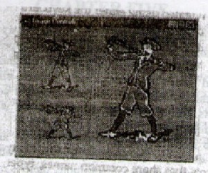
Stretch (Boolean) Indicates whether the picture has to be resized to fit the size of the control. This property is totally different from the picture box control’s Auto Size. When the auto size is set to false, only portion of the picture that fits into the current coordinates of the picture box is displayed. But when stretch is set to false the image control is resized to the coordinates of the picture. That is it behaves in the similar manner of the picture box control when its auto size is set to true. But when the stretch is set to true the picture will be enlarged or compressed to the current coordinates of the image control.
The Timer Control
The timer control is one of the few controls always hidden at run time. This means you don’t have to find room for it on a form-it can go anywhere, even on top of existing controls. The timer basically Do just one thing: it checks the system clock and acts accordingly.
The List Box Control
A list box is an ideal way of presenting users with all list of data. Users can browse the data in the list box or select one or more items as the basis for further processing. The user can’t edit the data in a list box directly-one way around that is to have a combo box instead; combo boxes are discussed next. When the list of data is too long for the list box then VB will add a vertical scroll bar.
List Box Methods
Add item adds an item to a list box at run time. For example, if the text in a textbox entered by the user is to be added to a list box this method can be used to do the same.
Syntax
List. AddItem item, index
The item argument specifies the text to be added to the list box. The index argument (optional) specifies the position whether the new item is to be place. For example, if the new item is to be inserted at the top of the list the index argument will have the value 0. if this argument is omitted, the new item will be placed are the bottom of the list.
The Month View Control
The month view control makes it easy for user to view and set data information via a calendar like interface. Users can select a single date or a range of dates.
The control can be navigated using either the keyboard or mouse. Buttons at the top to the control are used to scroll months in and out of view.
In addition, the control has the ability to display up to 12, months at a time. This can be helpful to give users the ability to view data information around the date of interest.
Control Arrays
A control array is an array of controls, in the same way that an integer is an array of integers. A group of controls that share common names, types and event procedures. Each control has a unique index. When a control in the array recognizes an event, it calls the event procedure for the group and passes the index as an argument, allowing your code to determine which control recognized the event. When you add a second control of the same type of the form, Visual Basic presents you a message asking ‘Do you want to create a control array’. Choose yes to create a control array.
By grouping similar controls into an array (much likes arrays that hold strings or some other data type), you can down on the amount of code in our program. Because all of the controls in the array share event handlers (for example), there is only one click event for an array of command button controls no matter how many controls are in the array) you do not have to duplicate event code for each individual control.
Combining dynamic controls with control arrays offers the best of both worlds’ dynamic controls enable your program to do a little jig in step with your end user’s needs the control) array enables you to easily mange the pool of dynamically crated control.
There are many benefits to using control arrays instead of several individual controls Fist, control arrays use fewer resources then individual controls. Second, controls arrays share common events. For example, if you have an array of command buttons. The same click event procedure is called no matter which button is pressed.
If you start with a text box name Text1 and select to create a control array. Visual Basic assigns Text1 an index number of 0 and creates a new member of the Text1 array. With an index number of 0 and creates a new number of the text1 array, with an index number of 1. if you make additional copies of Text1 or Text2, their index properties are set to 3,4 and on.
Example showing how to handle a click event for control arrays
Private Sub cmd button Array_Click (Index As Integer)
Select case Index
Case 0 textindex. Text = 1
Case1: textindex. Text = 2
Case2: textindex. Text = 3
Case3: textindex. Text = 4
Case4: textindex. Text = 5
Case5: textindex. Text = 6
End Select
End Sub.


